Guide
Mixing Natural Materials
Linen, jute, velvet, wood, brass and stone. What each one is good at, where the cheap version gives itself away, and how many textures a room can take.
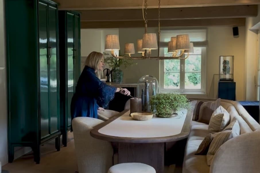
The warm, low-lit look is not a colour scheme. You can paint a room the exact right shade of ink green, put the exact right sofa in it, and still end up with something that reads flat and slightly cheap. What is missing in that room is almost always texture: too few materials, all of them smooth, all of them reflecting light the same way.
This is the part of the look that costs the least and does the most.
The five texture rule
A room needs materials doing five different jobs. Get one of each and the rest is detail.
- Something woven. Linen curtains, a wool rug, a jute base, a cane chair back. Matt, irregular, and it absorbs light.
- Something with a pile. Velvet, bouclé, mohair, sheepskin. It catches light at an angle, so it changes as you move.
- Something hard and warm. Oak, walnut, rattan, leather. The structure of the room.
- Something reflective. Brass, antiqued mirror, glass, in small amounts. These are what make a room look lit rather than merely bright.
- Something matt and cool. Stone, unglazed ceramic, plaster, marble. The full stop at the end of the sentence.
Keep the colours tight while you do it. A room with a narrow palette, warm white, sand, olive, oxblood, brown and a little brass, can carry an enormous amount of texture without looking busy. A room with six colours and six textures looks like a jumble sale.
Linen
Linen is the workhorse of this look, and the place it matters most is curtains.
Linen hangs with weight. It falls in soft, irregular folds rather than the flat sheets you get from a synthetic, and it filters daylight into something warm instead of blocking it or glaring through it. It also creases permanently, which is either the whole appeal or a reason to buy something else. There is no middle position.
What actually decides whether linen curtains look expensive:
- Fullness. Order fabric at two to two and a half times the width of the track. Curtains that only just cover the window when closed hang flat and look mean, whatever the fabric cost.
- Height. Fix the track close to the ceiling, or at least 15 to 20cm above the window frame, and let the curtains run the full drop to the floor. The cheapest way there is to make a room look taller.
- Width. Extend the track 15 to 25cm past each side of the window so the open curtains stack against the wall rather than over the glass.
- Length. Either clearing the floor by a centimetre, or with a deliberate 2 to 3cm break where the fabric touches. Curtains that stop at the radiator are the giveaway.
- Lining. Unlined linen glows in daylight and does nothing for warmth or blackout. Lined linen hangs better and lasts longer. In a bedroom, line it.
Elsewhere: linen bedding, loose linen covers, and a linen lampshade, which throws a warmer light than card does.
Velvet
Velvet is the piece of the look people reach for first, and the one worth rationing. It is a pile fabric, so it reads as depth. A velvet chair in a dark room has a lit side and a shadowed side, and that is what makes it feel rich rather than merely dark.
- Cotton velvet is the good one. Matt, deep in colour, marks where it is crushed and brushes back out. It ages into something better.
- Polyester velvet is hard wearing, cheap, and reflects light with a sheen that gives it away immediately, especially under warm lamplight.
- Mohair velvet is the expensive answer and worth touching once, so you know what you are approximating.
One velvet piece per room, a sofa or a chair or a pair of cushions or a curtain, is usually right. A velvet sofa with velvet curtains and velvet cushions stops being luxurious and starts being a hotel lobby.
Jute, rattan and cane
The cheap textures, and the hardest working. Jute and sisal on the floor give a room a base layer of roughness that everything else can sit against. Rattan and cane do the same at furniture height, and a caned cupboard door or chair back breaks up a wall of solid timber for very little money.
The rule with all three is that they should look like the plant they came from. Dyed, bleached or high gloss versions lose the only quality you were buying.
Wood
Two tones, clearly different, is the aim. A warm mid oak and a dark walnut, for instance. Trying to match every wood in a room to one tone is what makes a space look like a furniture set, and matching approximately is worse than not matching at all.
- Solid timber ages, takes a knock and can be sanded. Veneer over chipboard is fine for a side table under a lamp and disappointing anywhere hands go.
- Oiled and waxed finishes develop a patina and can be repaired at home. High gloss lacquer shows every scratch and cannot.
- Check where the grain runs, and whether it continues across a run of drawer fronts. Continuous grain is a sign somebody cared.
Brass and the other metals
Brass is the accent metal for this look, in small quantities: a lamp base, a picture light, curtain rings, the pulls on a cupboard.
Aged or antiqued brass is the finish to look for. Unlacquered brass gets there on its own, tarnishing unevenly over a few years into something darker and quieter. Bright lacquered brass stays the colour of a trumpet indefinitely and is the finish that most often reads cheap.
Mix metals deliberately: one dominant, one supporting, appearing three or four times so that it looks like a decision. Blackened steel and bronze both sit well against brass. Chrome does not sit well against anything here.
Stone, plaster and ceramic
A room full of soft things needs somewhere for the eye to stop. A stone or marble tabletop, a plaster wall finish, a couple of hand-thrown stoneware pieces with a chalky matt glaze. These are cool, hard and matt, and they do more for a velvet sofa than another cushion ever will.
Matt is the operative word. Polished marble is a different, shinier look; honed stone belongs to this one.
Leather
Worth a line of its own, because it is the only material on the list that is demonstrably better after ten years. Aniline and semi-aniline leathers develop a patina, while pigmented and bonded leathers wear through instead. A single leather object, a chair or a stool or the seat of a bench, carries a room.
What to leave out
High gloss anything. Chrome. Plastic rattan. Printed wood-effect laminate. Faux fur. These are not moral failings, they are simply materials that reflect light in a way that fights everything above, and one of them in a room is often the reason it will not come together.
The pieces
4 pieces
- Image
Sutton Linen Curtains (affiliate link to Halden Home, opens in a new tab)
€168at Halden Home
Washed linen, pencil pleat. Curtains are where linen earns its keep.
Ships to Ireland, the UK and Australia, not the US
- Image
Halcombe Velvet Cushion Cover (affiliate link to Norrick Trading, opens in a new tab)
€32at Norrick Trading
Cotton velvet with a linen reverse, so two of the five textures arrive in one object.
Ships to Ireland, the UK, Australia and the US
- Image
Frei Oak Nesting Tables (affiliate link to Nordhavn Interior, opens in a new tab)
€245was €295at Nordhavn Interior
Solid oak with a soft-oiled finish, which ages instead of chipping.
Ships to the EU and Norway, not the UK, the US or Australia
- Image
Sable Ceramic Vase (affiliate link to Maison Duroc, opens in a new tab)
€38at Maison Duroc
Hand-thrown stoneware with a chalky matt glaze, to break up all that softness.
Ships to the EU, not the UK, the US or Australia
Common questions
- How many different materials should one room have?
- More than most people are comfortable with. Five is a sensible target, something woven, something with a pile, something hard and warm, something reflective and something matt and cool, and the reason rooms look flat is almost always that they have two. What a room cannot take is five materials all shouting, so keep the colour palette tight and let the textures do the work.
- Is it acceptable to mix metals?
- Yes, and a room where every metal matches looks like a showroom. Pick one metal to dominate, usually an aged or antiqued brass for this look, and let a second appear two or three times as a deliberate contrast, typically blackened steel or bronze. What does not work is three metals at equal weight.
- Do I have to match my wood tones?
- No, and matching them is the more common mistake. Two tones that are clearly different, a mid oak and a dark walnut say, read as a room assembled over time. Two tones that are nearly but not quite the same read as an error. If everything must match, match the finish rather than the colour.
- Is velvet practical?
- Cotton velvet is more practical than it looks and more delicate than a flat weave. It marks where pressure has crushed the pile, which brushes out, and it shows dust on the arms. Polyester velvet resists both and looks it, because it reflects light in a sharper, colder way. One velvet piece per room is usually the right amount.
- What about unlacquered brass?
- It tarnishes, unevenly, and that is the point. Unlacquered brass ends up with the darkened, slightly greenish patina that reads as old and expensive. Lacquered brass stays bright and yellow for ever and is the finish that most often looks cheap. If you want the aged version now rather than in five years, buy things described as antiqued or aged brass.